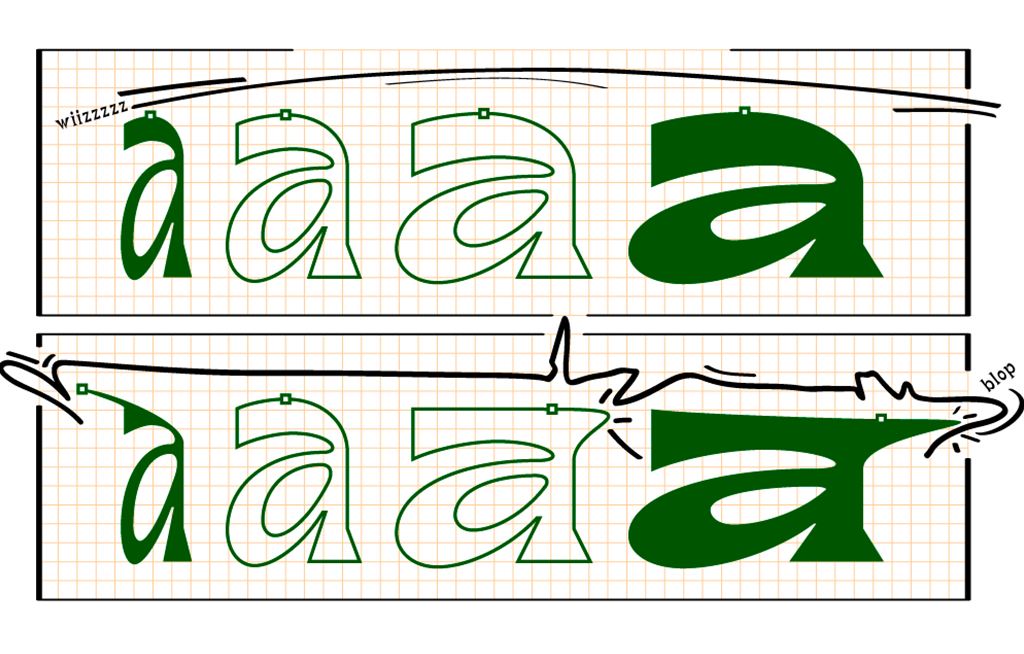
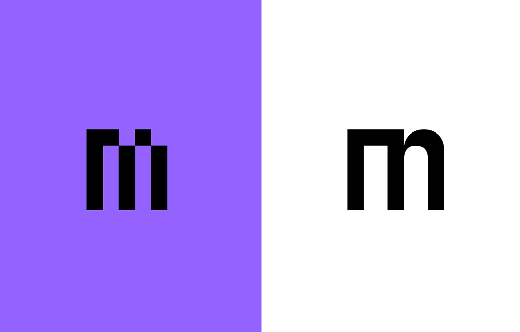
A Clear Idea of the Skeletons
N.30 – Axo, Charles Mazé & Adrien Vasquez
Axo, designed by Charles Mazé, is a rounded geometric typeface that draws on various writing models from the United Kingdom, Germany and France, whose publication followed the arrival of the “Redis” or “plattenfeder” nibs, produced in…
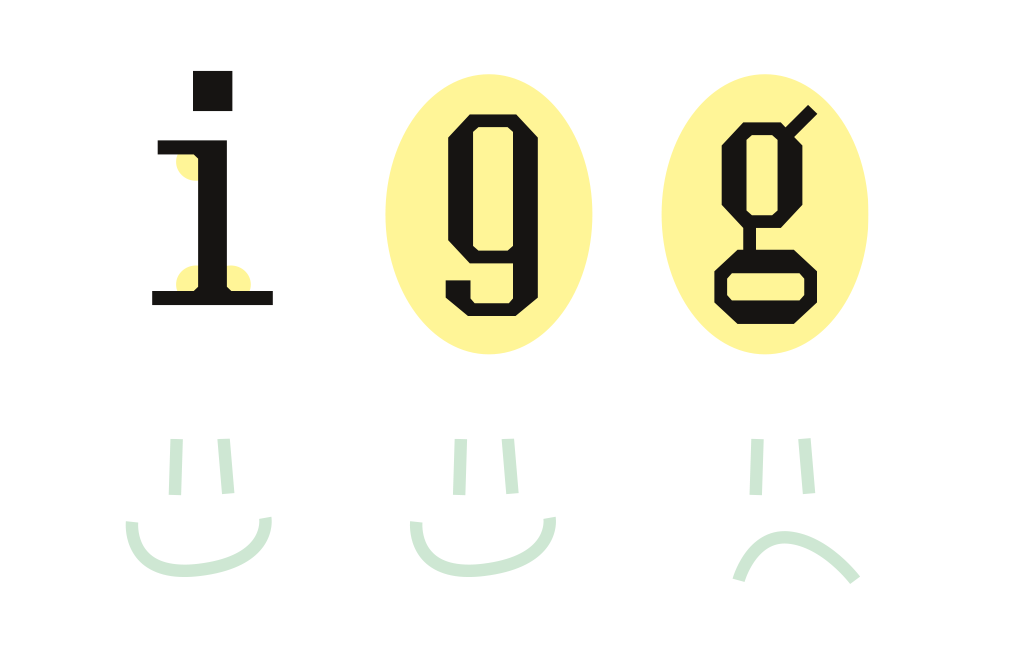
Writing One's Name
N.29 – AOZ, Marion Bataille
In this issue, Marion Bataille publishes a score of gestures for combining the geometric shapes that make up AOZ, her unicameral alphabet around which workshops are organised to introduce typography through manipulation (rather than drawing)…
FACE A/FACE B, PVC Type Project, Before and Beyond
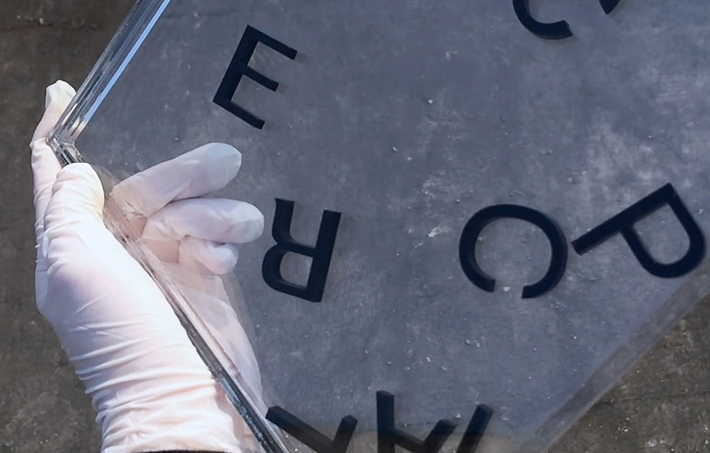
N.28 – PVC/Lettering, Hélène Marian
In this specimen, Hélène Marian puts her type design and sign painting practices back to back. On the recto, a noise solo typeset in PVC, an off-standard typeface made up of…
Because Comic Sans MS Isn't Funny
N.27 – Not Comic, Louis Garrido & Harrisson
Love it or hate it, the comic sans is finally out of business because of her sister the Not Comic. Straighten out by Harrisson and Louis Garrido and then revived by Comviz's students from the Royal Academy of Fine Arts, Brussels, the Not Comic is portrayed throughout a…
Cut From Vinyl
N.26 – Crickx/Publi Fluor, Chrystel Crickx & Crickx Lab
What is commonly known as “la Crickx” (recently renamed Publi Fluor) is a typeface that Chrystel Crickx used to cut from vinyl in a variety of colors and sell in her Schaerbeek (Brussels) store before the year 2000…
Scotch Romans
N.25 – Cardone, Fátima Lázaro
With Cardone, Fátima Lázaro reverses the function of the character specimen to share part of a bibliography published by alphabettes.org. taking stock of the position of women in the typographical field.
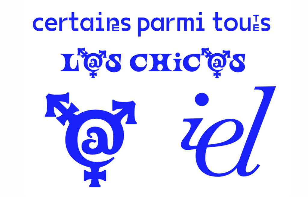
Des imaginaires possibles autour d’une typographie inclusive
N.24 – Various typefaces, Bye Bye Binary
The collective Bye Bye Binary uses La Perruque for an “exquisite corpse” exercise, presenting a large number of typographic proposals overcoming gender binaries…
The World Upside Down
N.23 – Syllaba, So-Hyun Bae
In order to design Syllaba, So-Hyun Bae followed the specific way of composing the Korean writing system that works in combination. This issue is about “verlan,” a…
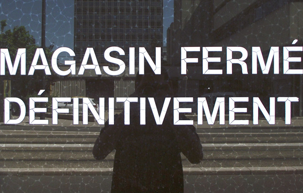
Correspondance at Liège Station
N.22 – Correspondance, Radim Peško
This special issue has been designed in the context of a workshop during Fig., the graphic design festival in Liège. Workshop participants were invited to…
A Petition of the Left Hand
N.21 – La Gauchère, Marion Cachon
From her “gaucherie” Marion Cachon draws a methodological and creative force in order design a troubling and riveting font that surpasses the pejorative…
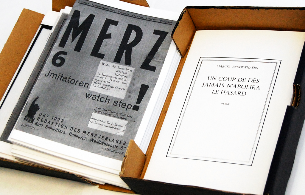
Bootlegs, Reprints & Détournements
N.20 – N/A, antoine lefebvre editions
On the occasion of 20th issue of the magazine, antoine lefevre editions and La Perruque have published a facsimile of a 2 × 90 cm tract from the Situationist International…
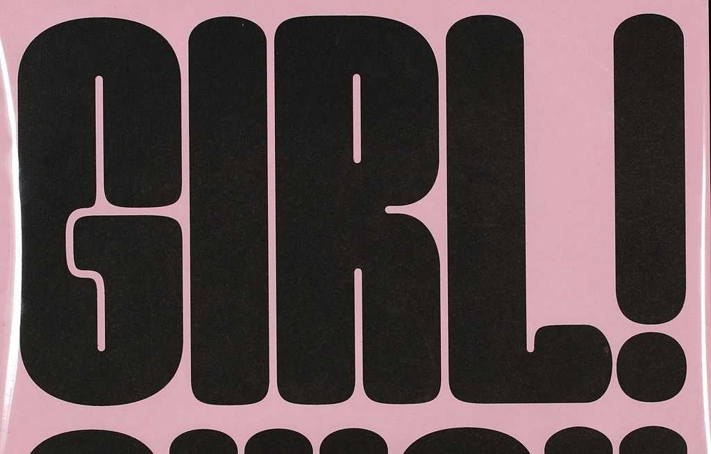
Kerning Queen
N.19 – Good Girl, Marion Bisserier
Marion Bisserier proposes an ironic reaction to the underrepresentation of women in the typographic industry by saturating space with her Good Girl font…
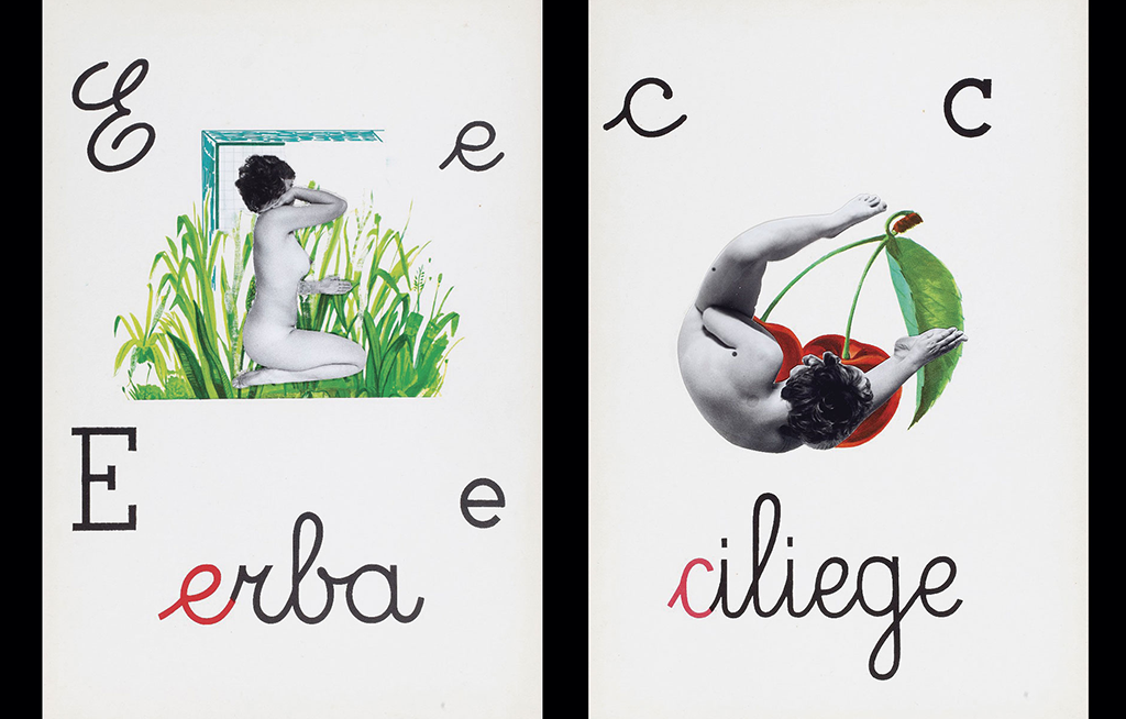
In the Kitchen
N.18 – Cucina, Lucas Le Bihan
Inspired by the work of Italian artist Tomaso Binga, Lucas Le Bihan designed Cucina in the perspective of a culinary editorial project. Cucina combines a rigid structure with…
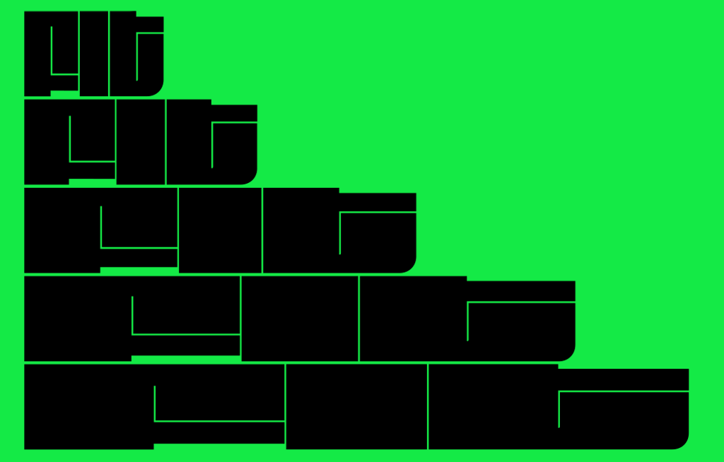
Filling Space
N.17 – Fit, David Jonathan Ross
When he designed Fit in 2017, David Jonathan Ross was one of the first to make use of variable fonts technology. With this typeface he blatantly demonstrates the infinite…
Down-to-earth
N.16 – Helvetica on the earth, Weiyi Li
Graphic designers use various concrete terms to describe typesetting, like weight and density. Designers of Chinese characters even emphasize…
The Map as a Discursive and Properly Committed Tool
N.15 – Mange-pierre, Julien Vallet
On the occasion of a workshop at La Cambre visual arts school, students explore typographic stakes within a cartographic context, offering a utopian…
One Piece at a Time
N.14 – Covington, Sans niveau ni mètre
For the closing of the exhibition One Piece at a Time: les arts tactiques au travail at the Cabinet du livre d’artiste, La Perruque and Sans niveau ni mètre have co-edited…
Infrathin & Infra-ordinary
N.13 – Immortel, Clément Le Tulle-Neyret
Closely exploring the notion of infrathin, the collage of extracts chosen by Clément Le Tulle-Neyret in the thirteenth issue of La Perruque offers a retort to…
KOPY ME = Brutalist + Monospaced + Extra wide + Monolinear
N.12 – KOPY ME, Swiss Typefaces
For their test phases, Swiss Typefaces have used the pages of La Perruque to organize a high-speed launch of the KOPY ME experimental font in the entire specimen…
Typographic Declassification
N.11 – Arcturus, Laurent Müller
As an introduction to his typeface, Laurent Müller has written a typographic and poetic “declassification” hybridizing forms and genres…
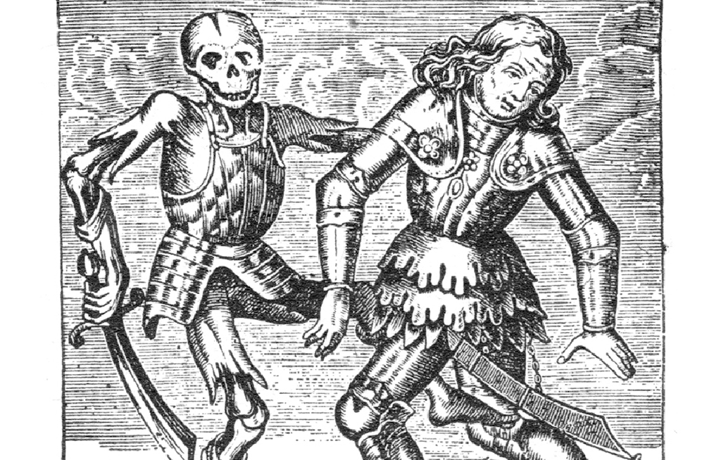
Memento Mori
N.10 – Petite mort, Yoann Minet
The Petite mort specimen is a game of typographic knucklebones that dance on the grave of its most illustrious ancestors. Memento mori.
Sun Stencil
N.09 – Graduel, Alice Jauneau
Alice Jauneau stages the “sun-stenciled” letters from a choir songbook with an eclipse-like specimen that only reveals its content on printed paper when exposed to daylight. ☾ ☼
A Talkative Font
N.08 – BB-Book A, Benoît Bodhuin
Wham bam! The thunderous BB-Book lands on La Perruque for an eighth issue as contrasted and expressive as this unabashed type…
Typographic Warm-Up
N.07 – Savate, We.ch
Between well-placed kicks and fearsome uppercuts, the dexterous Savate will always escape the ropes undamaged! We.ch graces us with…
A Display Typeface with Industrial Roots
N.06 – Kreuz, Large
Like a conveyor belt whose constant motion subjects factory workers to their task, each blank space on this issue offers the opportunity…
Somewhere between the Micron and the Kilometer
N.05 – Millimetre, Jérémy Landes-Nones
Jérémy Landes-Nones pushes the limits of the Millimetre by sampling it on a print chart highlighting its manifold cadences…
From Bitmap to Bézier Curves: a Translation
N.04 – VG5000, Justin Bihan
Quoting the end of Philip K. Dick’s short story “Pay for the Printer,” Justin Bihan responds to Alex Chavot (N.01) and proposes a return to craftsmanship…
Step by Step
N.03 – Steps Mono, Raphaël Bastide
Raphaël Bastide tries to make his fortune by selling his friends and relatives classified ad spaces on his strip of paper: €1 for 10 cm.
One for the Price of Two
N.02 – Lumette Vinyle, Axel Benassis
“One for the price of two” is Axel Benassis’ proposed absurd discount for Lumette Vinyle, a type that foresees the alterations…
Planned Degeneration
N.01 – Grotex Micro, Alex Chavot
Alex Chavot inaugurates the first issue of La Perruque with extracts taken from the opening of Philip K. Dick’s short story “Pay for the Printer.”…