Words by So-Hyun Bae
English version | Lire la version française →
Issue N.23
Dec. 2021
Author: So-Hyun Bae
Font: Syllaba
Guest editor: Marine Montagné
Printed in the margins of:
Graphius, Brussels [BE]
± 200 copies
Printed in the margins of:
Graphius, Brussels [BE]
± 200 copies
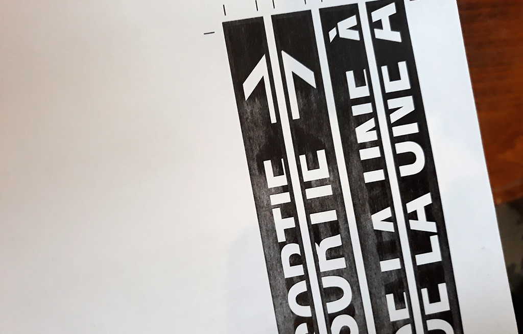
In order to design Syllaba, So-Hyun Bae followed the specific way of composing Hangeul, the Korean writing system that works in combination. This issue of the magazine is about verlan, a peculiar French jargon where syllables are switched within a word. (For example, merci becomes cimer.) This issue presents a curious structure that imitates the principle of verlan.
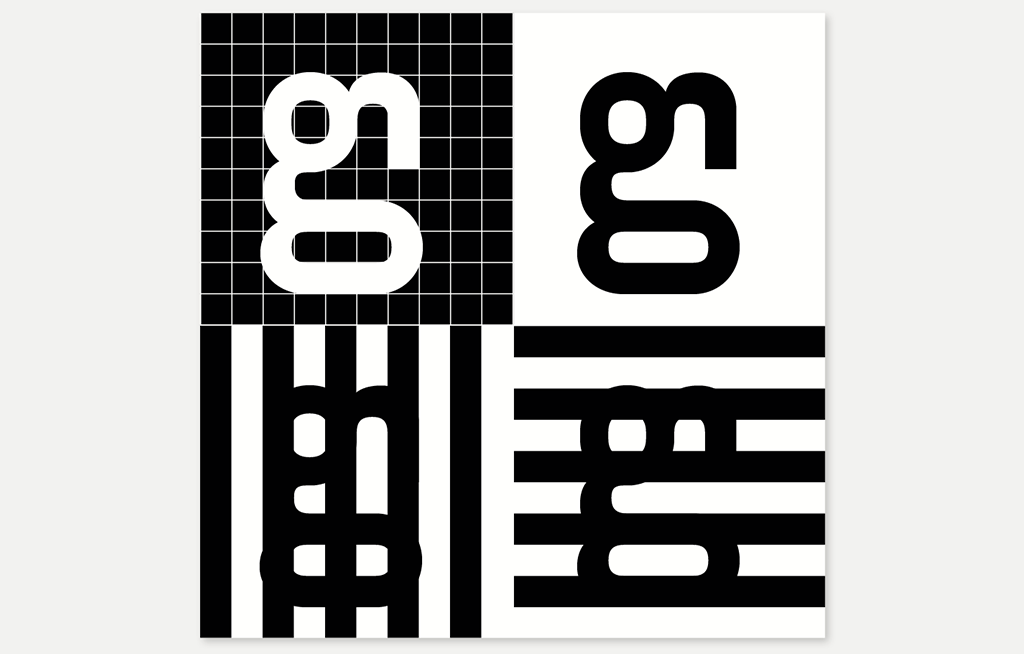
Syllaba is an experimental typeface inspired by Hangeul, the Korean writing system that works in combination of jamos. Jamos are the smallest units that make up Hangeul and these are combined within a character to form a syllable. To obtain one syllable, the composition must include at least one consonant (jaeum) and one vowel (moeum). There are primarily two types of syllables: those that end with a vowel and those that end with a consonant (also called "open" and "closed" syllables in linguistics). The Korean alphabet consists of 14 jaeum [Fig. 1] and 10 moeum [Fig. 2] and there are mainly 6 models of composition [Fig. 3].
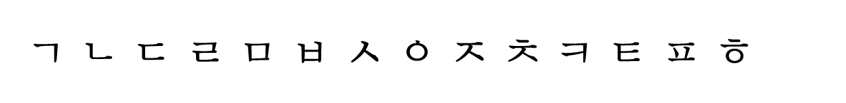
Fig. 1. 14 jaeum.
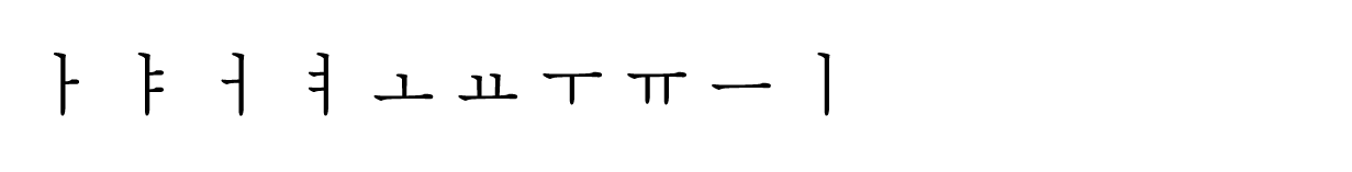
Fig. 2. 10 moeum.
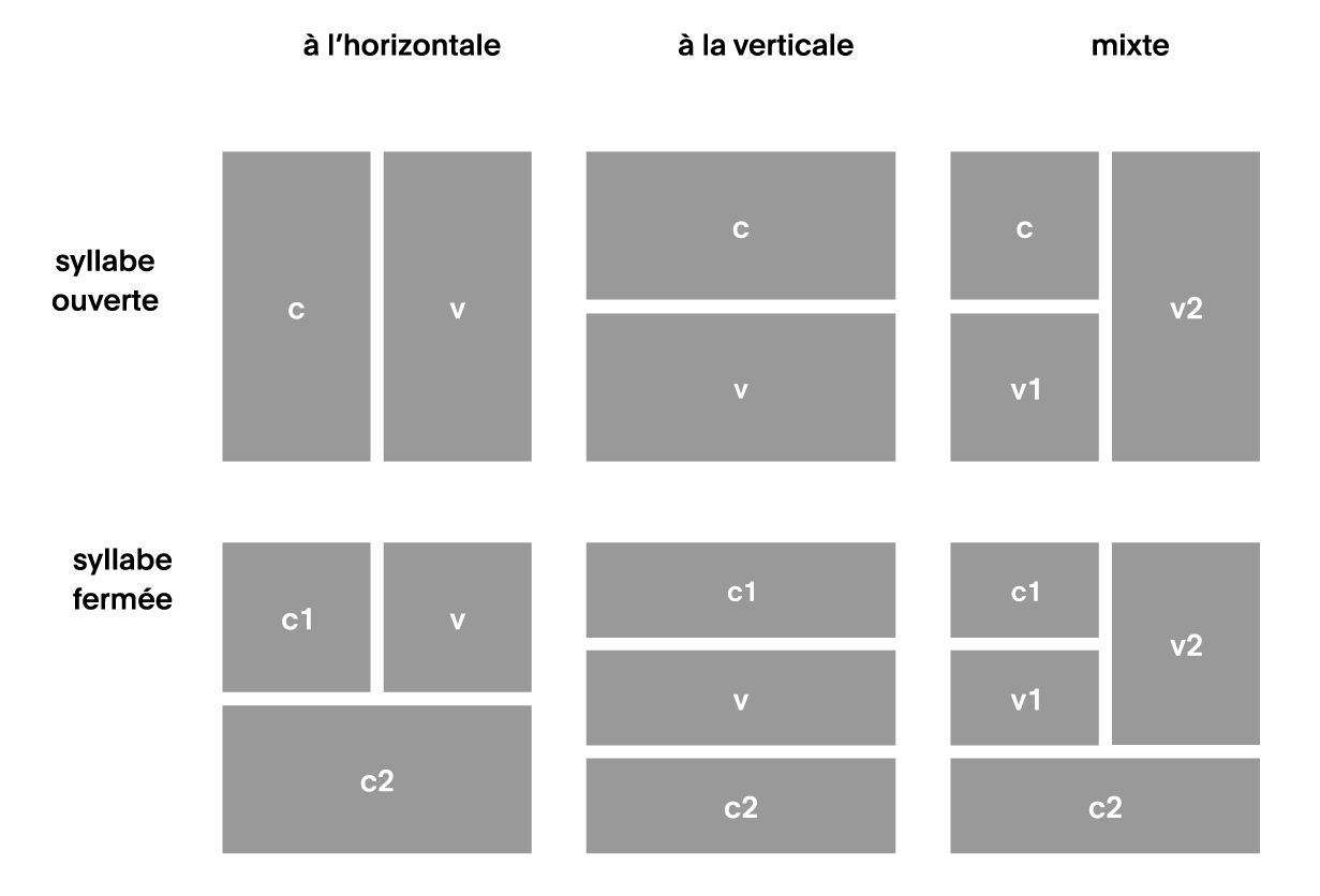
Fig. 3. Composition patterns (c=consonant, v=vowel).
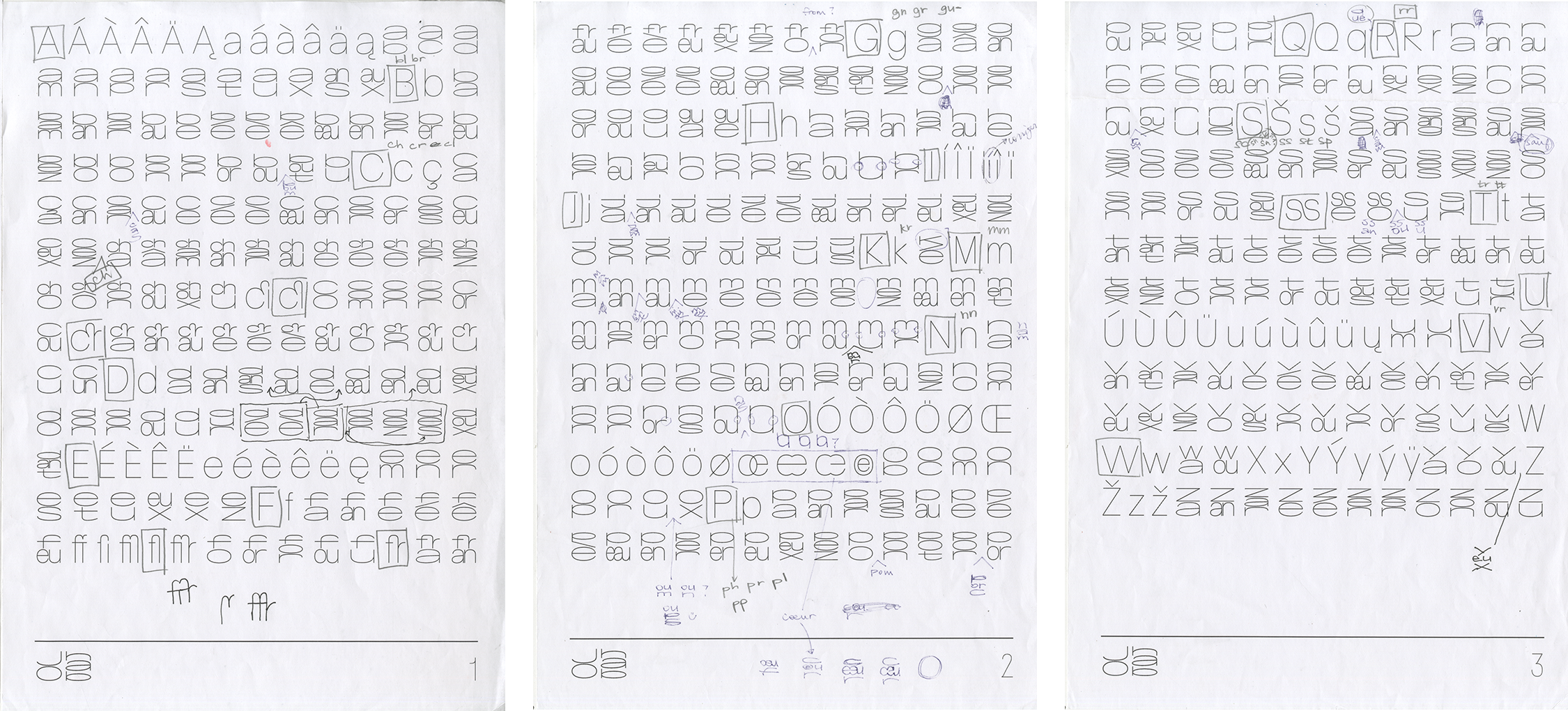
In order to apply this Korean writing system to Latin, I began by listing the 36 phonemes of the French language to put together an “extended alphabet”, without forgetting that in French, there can be several spellings for the same phoneme. For example, the phoneme /o/ can be written as: “o”, “au”, “aud”, “ault”, “eau”, “eaux”, etc.
Other than simple phonemes such as /ʃ/, /ɲ/, and /f/ (“ch”, “gn”, “ph”), I also included in this “extended alphabet” more complex phonemes such as /bʁ/, /kʁ/, /fʁ/ (“br”, “cr”, “chr”, “phr”).
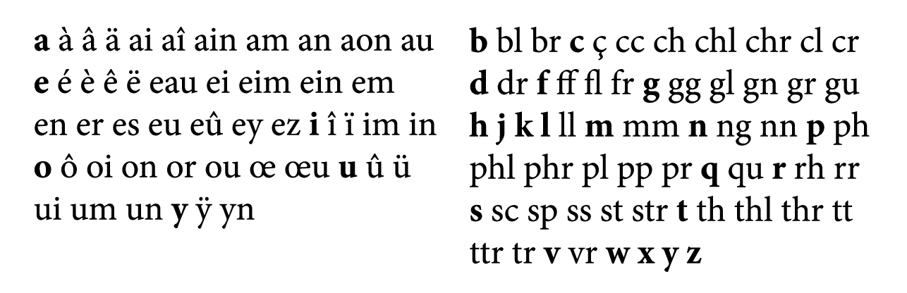
Fig. 4. Latin extended (although this list is not exhaustive).
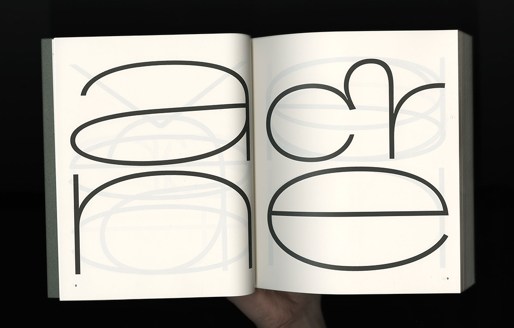
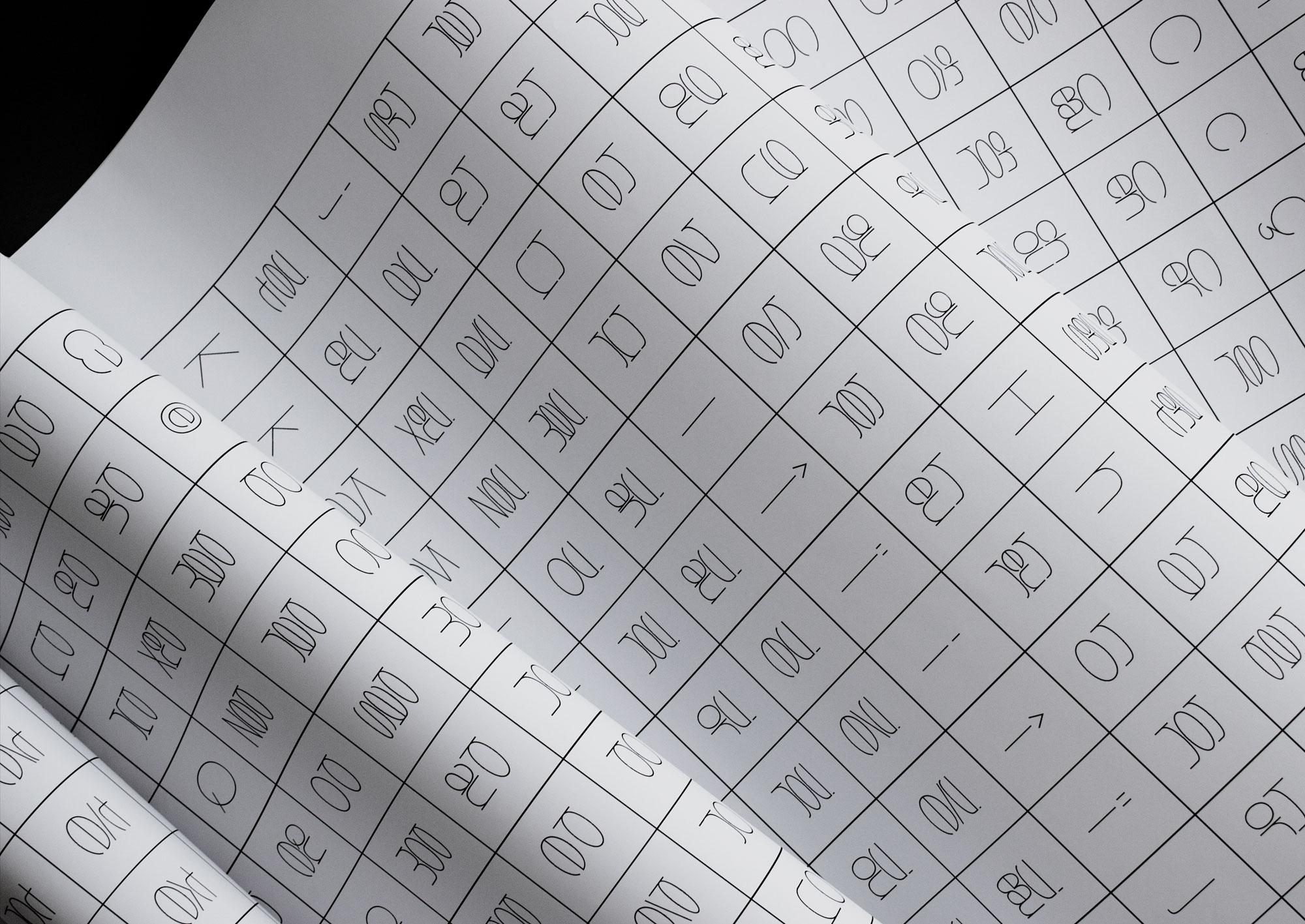
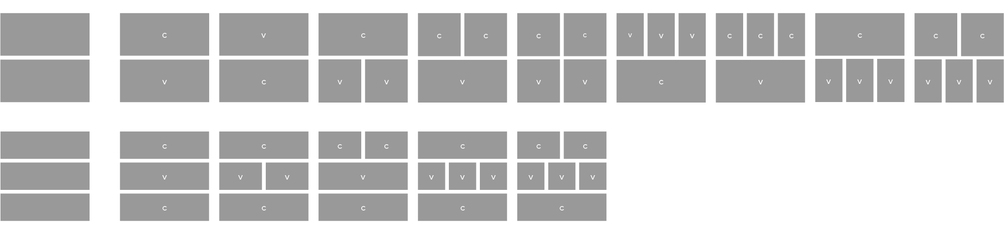
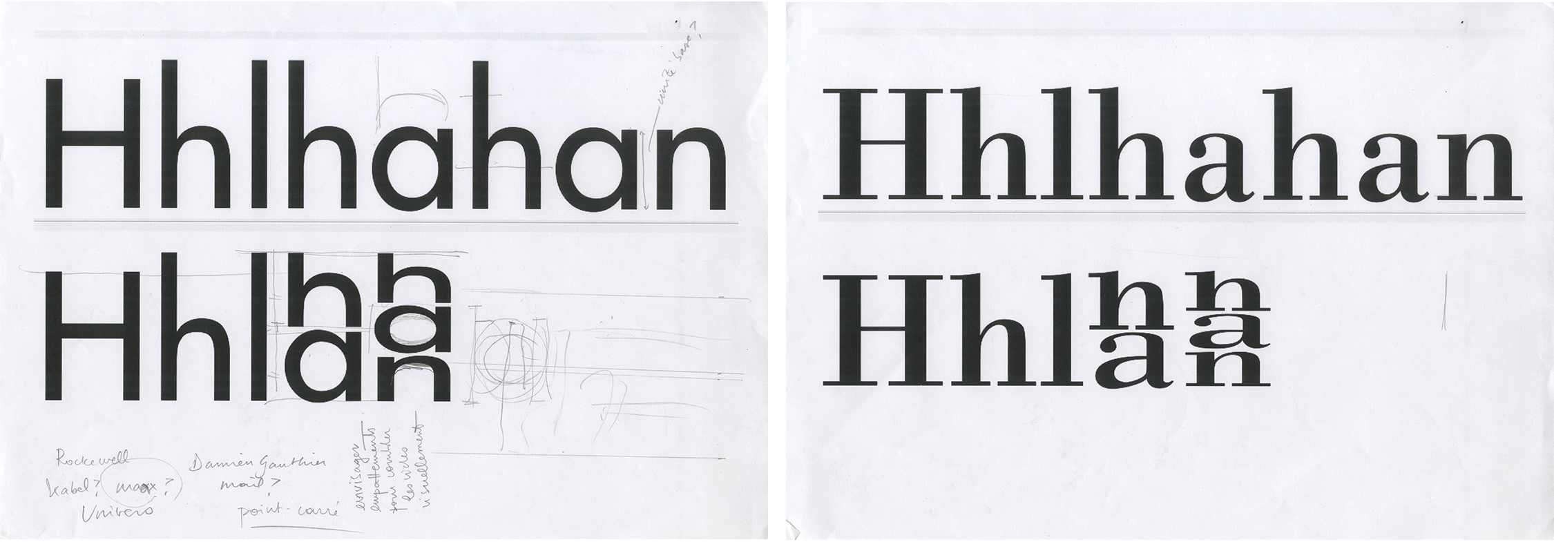
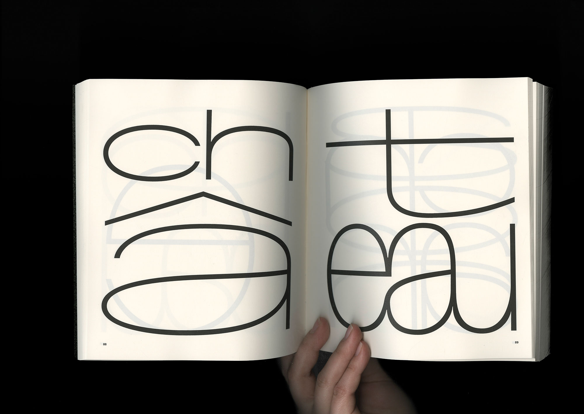
As I applied this specific way of composing Hangeul onto Latin, I began to design my typeface based on two different structures: a structure on two “stories” and another on three “stories”. [Fig. 5]
In Hangeul, with its different models of composition and 24 jamos, it is possible to compose up to 11,172 characters. I will leave you imagine the number of glyphs for French…
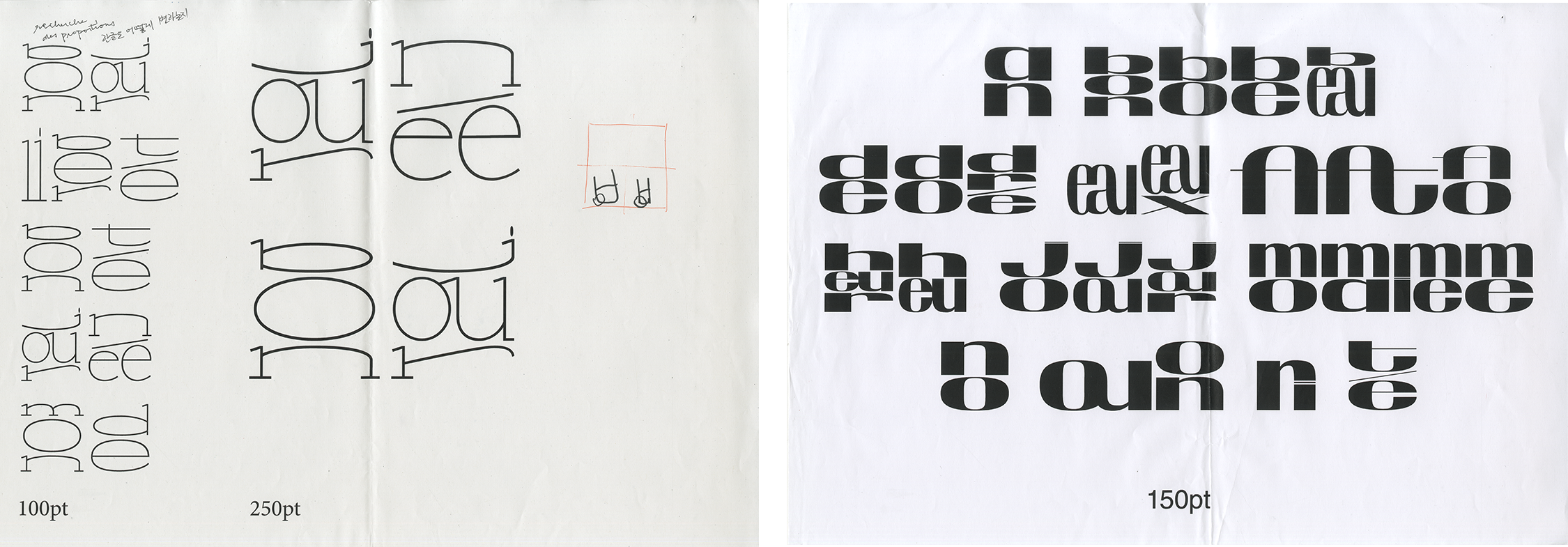
Before obtaining monolinear shapes, I tried different versions of this typeface by adding serifs, more contrast, or more thickness. But considering the complexity of each glyph, I quickly decided to favor simplicity to preserve legibility.
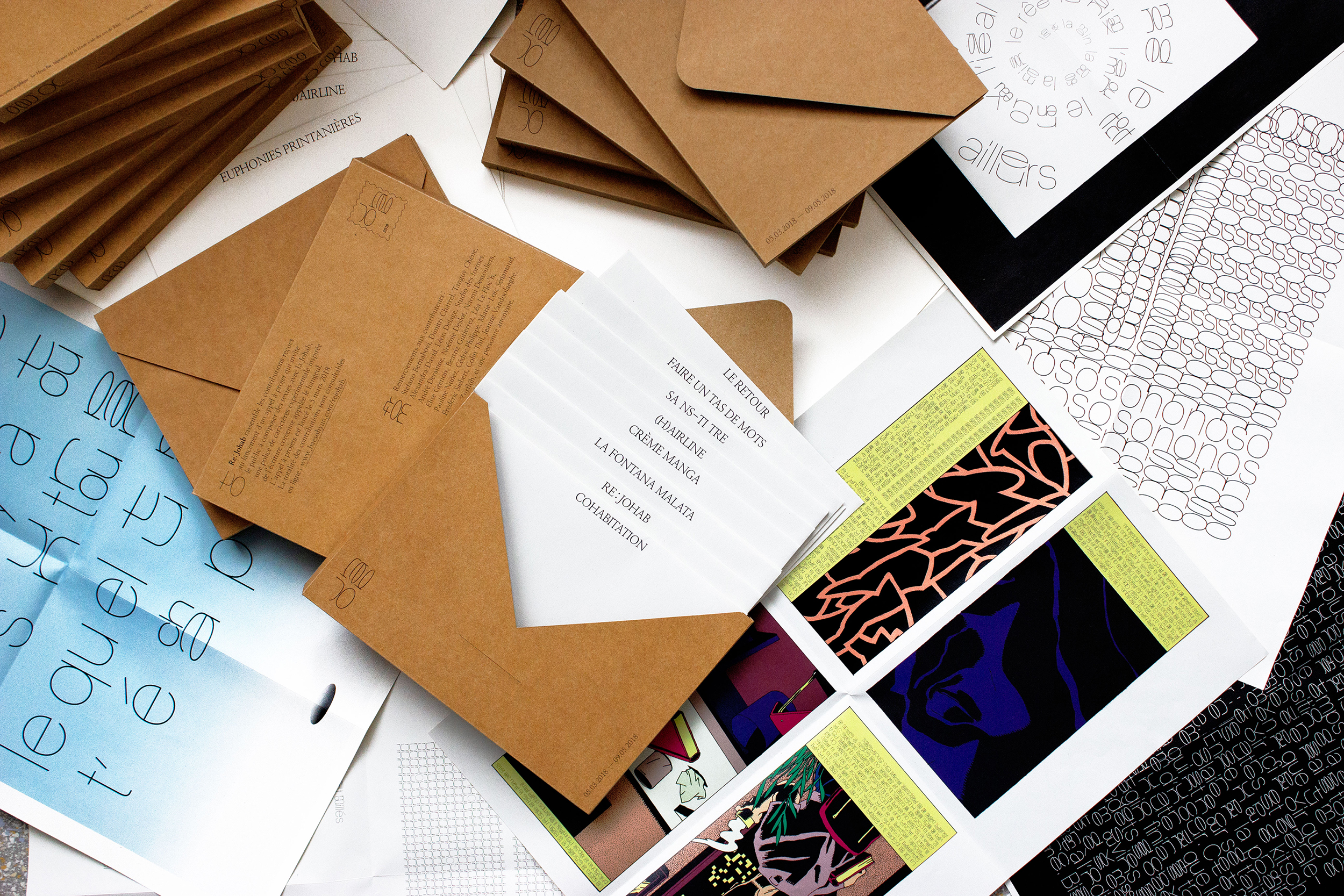
For my master's degree in 2018, I designed about 700 glyphs; enough to start composing texts which enabled me to carry out several graphic experiments.I launched a call for projects Re:Johab (“Johab” was the provisional name of Syllaba) where I invited the public to use my typeface. From the various contributions from poets, writers and graphic designers, I was able to observe how this typeface that originated from Hangeul, could be adapted to French. (The contributions can be viewed here)
During my post-master studies at the Atelier national de recherche typographique I chose to focus my research not on this type design project itself but rather on what it was opening to. My research was therefore focused on the relationship between typography and linguistics. I picked up Syllaba only at the end of my research.
I realized that this project emerged from my interest in multiscript typography as I became fascinated by typographic matchmaking and the harmonization of different writing systems. It seems that my vision of matchmaking was idealized. I was attracted by the somewhat utopian idea of finding a way to unite different scripts despite their great differences. Syllaba is therefore a typeface that tries to homogenize—a little naively—the different colors that can be obtained in Latin or Hangeul texts.
Today, I am continuing this project by coupling my initial naivety with the methodology acquired during months of research at the ANRT. If a complete Hangeul font includes 11,172 glyphs, what would be the number of glyphs in an equally complete French font that would include all the syllables of the language? What if we added an English font with all the existing syllables? Or Spanish? As an ambitious and tedious project, Syllaba is a typeface that is bound to remain unfinished, but that will thus lead to tireless research.
Test here a previous version of Syllaba.
So-Hyun Bae is a French-Korean graphic designer and typographer. Spending her childhood moving around between Korea, France and the United States, adapting herself to new environments and learning new languages have been a way of survival but also gradually become a passion. Realizing that typography is in the intersection of her interests for graphic design and languages, she joins the ANRT (Atelier national de recherche typographique, Nancy, France) in 2018 where she carries out a research on multilingual design.
Links:
baesohyun.com • Instagram • Contributions to Re:Johab
Presentation on multilingualism at ANRT: https://vimeo.com/398761160