Words by Charles Mazé & Adrien Vasquez
English version | Version française à venir
Issue N.30
Oct. 2025
Authors: Charles Mazé & Adrien Vasquez
Typeface: Axo
Printed in the margins of:
Cultura, Wetteren [BE]
± 400 copies
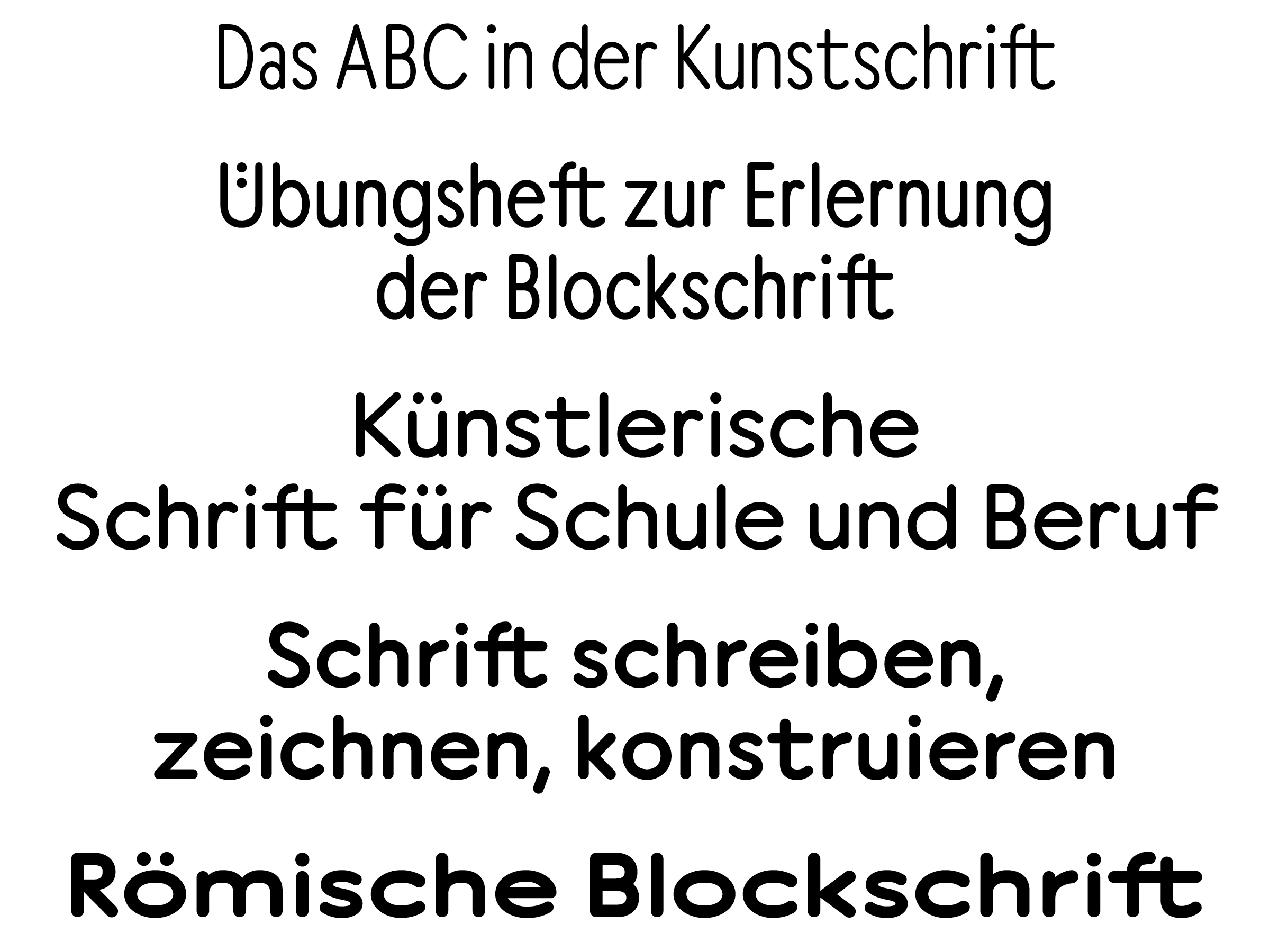
Axo, designed by Charles Mazé, is a rounded geometric typeface that draws on various writing models from the United Kingdom, Germany and France, whose publication followed the arrival of the “Redis” or “plattenfeder” nibs, produced in 1912 by the German pen manufacturer Heintze & Blanckertz and soon imitated abroad. These nibs make it easy to draw strokes of constant weight and characteristic rounded ends.
Together with Adrien Vasquez from Abyme foundry, they designed this specimen to fit the dimensions of the magazine and demonstrate the flexibility these models allowed for easy shifts of width and weight, foreshadowing the typographic variations that would become commonplace in the second half of the 20th century.

Axo, designed by Charles Mazé, was published in 2024 by Abyme, a type foundry founded by John Morgan and Adrien Vasquez in London. It is a rounded, monolinear and geometric typeface that draws on various 20th-century writing models from the United Kingdom, Germany, and France. The ubiquitous letterforms, found on school manuals, technical drawings and architectural plans contributed to the enduring use of sans serif typefaces and the development of “rounded” typefaces that are still commonly used today.

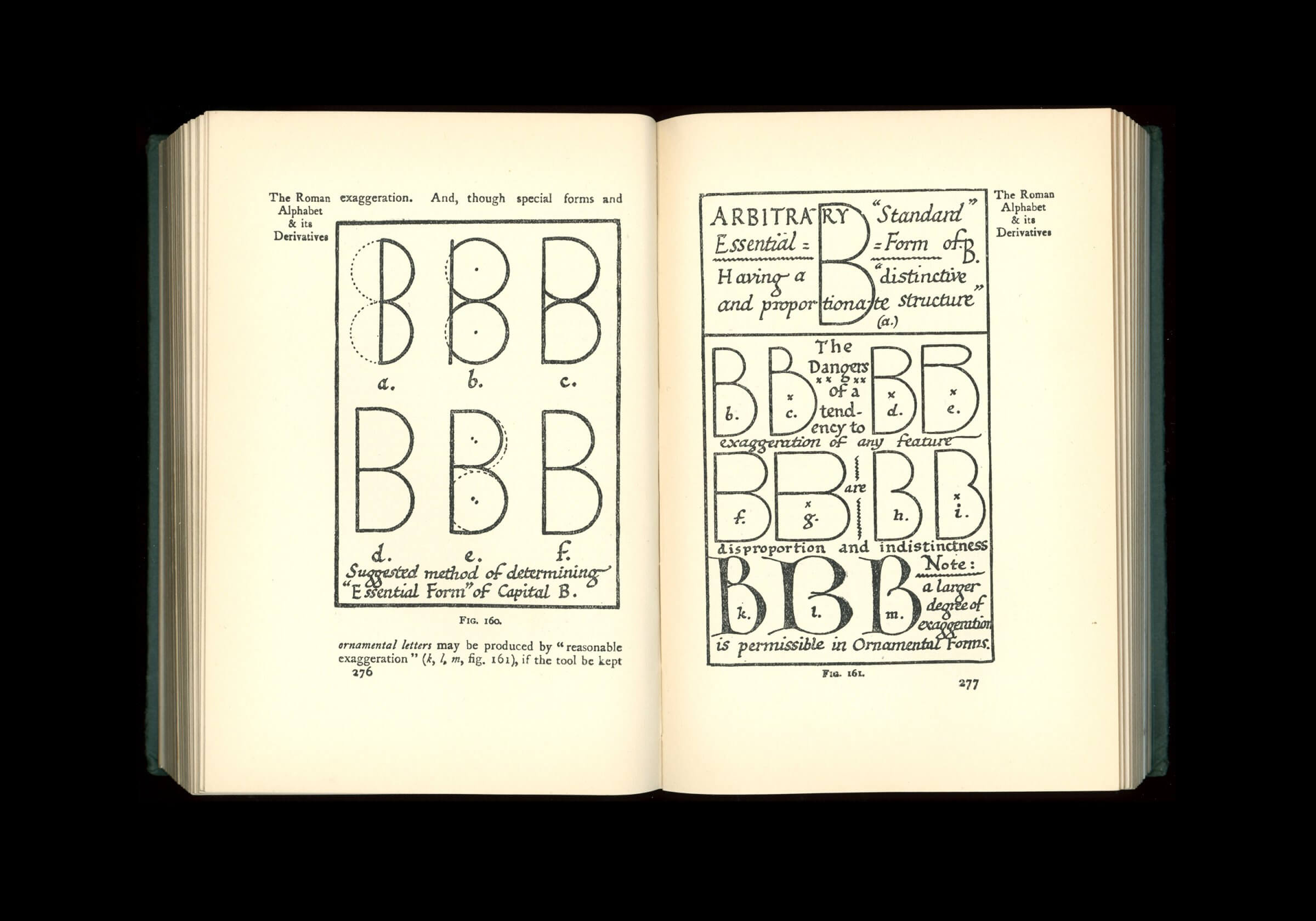
Edward Johnston, essential form of uppercase B in Writing & Illuminating & Lettering (1906).
In 1906, British calligrapher and type designer Edward Johnston stripped the roman alphabet to expose its “essential forms”.[1] This simple, monolinear letterform was quickly borrowed by educators to teach children how to write a “print-script” or “block letters”.[2] “Redis” or “plattenfeder” (palette) nibs , produced in 1912 by the German pen manufacturer Heintze & Blanckertz and soon imitated in Germany and abroad, would become reliable tools to easily make strokes of constant weight and the distinctive rounded terminals (“schnurzug”), which are the natural product of the shape of the nib. These tools sparked the production of many writing manuals for “blockschrift” letters, often using primary forms as a starting point: a triangle for the A, a perfectly orthogonal X, and a circular O.

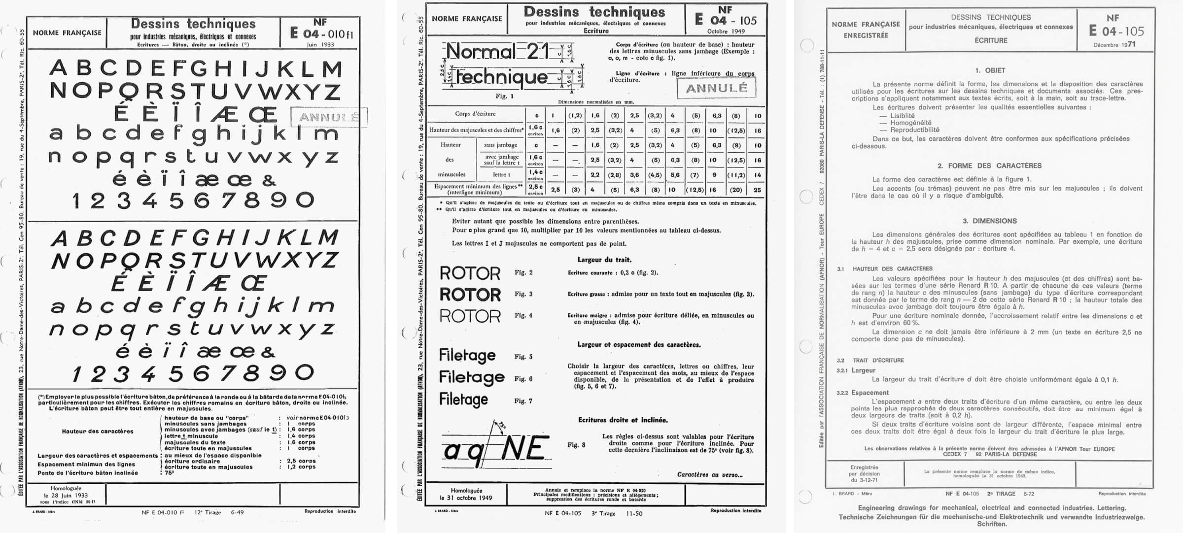
French lettering standards published by the Afnor: CNM-50/E04-10 (1932–33) and E04-105 (1949 and 1971).
In the following years, many countries established national standards for handwriting and lettering in the fields of mechanics, engineering, public works, construction, architecture and urbanism. The need for compatible standards between different countries led to the creation of the International Organisation for Standardisation (ISO) in 1947.
In France, the Association française de normalisation (Afnor) was created in 1926 for this purpose. They would go on to publish three standards. The first, E04-10, from 1932–33, is an “écriture bâton” (sans serif) in the style of those found in France at the same period, lacking the confidence of their contemporaries from Germany and Switzerland, but charming nethertheless.[3]

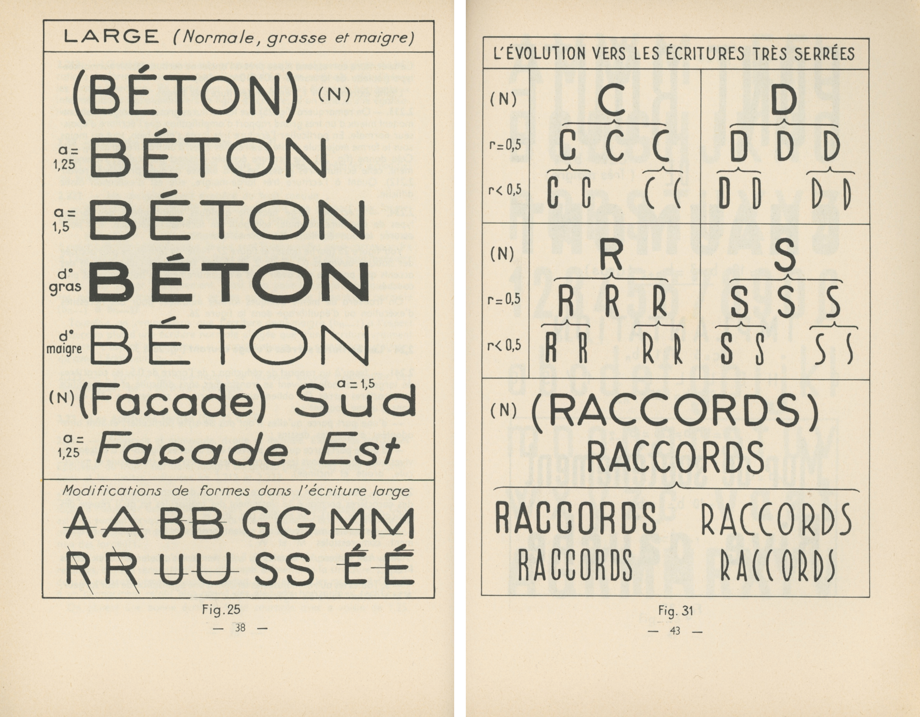
Variations of thickness and letter width in the E04-105 standard. From Georges Kiénert, Jean Pelletier, Les écritures bâton dans le cadre de la normalisation (1959).
The second standard, E04-105, from 1949, is similar to the “écriture script”, a model introduced in 1945 in the French school curriculum. Also described as “écriture technique normalisée”, E04-105 fulfilled the need for simplicity and legibility in drawings, diagrams, and plans much more efficiently than its predecessor. It would be turned into stencils, whose widespread use would reinforce a feeling of a stereotyped, engineered appearance. The model’s flexibility allowed for easy shifts of width and weight (the latter obtained by changing the writing tool), foreshadowing the typographic variations that would become commonplace in the second half of the 20th century.
E04-105’s successor, from 1971, is an unrelated, more technical model traced over a grid (a “technoid blockschrift”).[4] Its shapes are sturdier than those of E04-105, as they needed to withstand the important scale reduction allowed by the newly introduced photocopiers.
In the spirit of its models, Axo was designed as a “stroke font”. “Skeletons” were drawn in different widths, and strokes were applied to the path to obtain different weights, favouring geometry over typographic refinement and optical corrections. It is available in 15 styles: 3 widths (Narrow, Normal, Wide) and 5 weights (Light, Regular, Book, Medium, Bold), which are intended to work together, paired to create rhythm, hierarchy and emphasis. An italic style is in preparation.
For more about letterings standards, read Charles Mazé’s Essential forms on Abyme’s website here (in English). A French translation of the essay will be published by Association Presse Offset in their Petite collection soon.
Notes
‘The essential or structural forms are the simplest forms which preserve the characteristic structure, distinctiveness, and proportions of each individual letter. The letter-craftsman must have a clear idea of the skeletons of his letters.’ Edward Johnston, Writing & Illuminating & Lettering (London, 1906), pp 240–42 and 276–77. ↩
Sue Walker, ‘Letterforms for handwriting and reading: print script and sanserifs in early twentieth-century England’, Typography Papers 7 (London: Hyphen Press, 2007). ↩
Sébastien Morlighem, SANS (FR) 1628–1924 (Le Havre: Éditions Non Standard, 2022). ↩
Ferdinand Ulrich, ‘Standardised letterforms: some notes on the origins of Isonorm’ (Bad Salzuflen: neue, 2024). ↩
Axo
Available for purchase at Abyme.
Charles Mazé is a graphic and type designer based in Paris. He works with Coline Sunier since 2009. They were fellows at the French Academy in Rome–Villa Medici in 2014–15, and graphic designers in residency at Contemporary Art Center CAC Brétigny from 2016 to 2025. Charles is part of the teaching staff of Atelier National de Recherche Typographique (ANRT) in Nancy, France.
Links:
Coline Sunier & Charles Mazé • Instagram
Adrien Vasquez is a graphic and type designer. He worked with John Morgan since 2011. In 2017, they founded Abyme, a digital type foundry and independent publisher of artist’s editions and multiples. Following John Morgan’s death in 2025, he co-founded Lima Vasquez studio with Teresa Lima. He teaches at ÉSAD Valence.